I came to Germany with a graphic design background, ready to make things beautiful. Two years into my computer science studies here, I’ve learned something uncomfortable: sometimes the best design is the one you barely notice.
This revelation hit me hardest when comparing the tools I use daily. On one side, there are the sleek, venture-backed apps with delightful micro-animations and onboarding flows that feel like guided meditations. On the other, there are German-made tools that look like they were designed in 2010—and somehow work better.
The Philosophy: Zweckmäßigkeit
Germans have a word for it: Zweckmäßigkeit—fitness for purpose. It’s the principle that every element should earn its place by serving a function, not by looking pretty.
Walk into any German workshop, factory, or engineering lab, and you’ll see this philosophy in action. Tools are organized for efficiency. Interfaces are dense with information because that information matters. There are no decorative flourishes, no “delightful” touches that slow you down.
At first, coming from a design background, this felt wrong. Where was the personality? The brand expression? The delight?
Then I started building my own projects. And I realized: every pixel you add is a decision users have to process. Every animation is time they’re waiting. Every “delightful” touch is potential confusion for someone trying to get work done.
What This Actually Looks Like
German banking apps are my favorite example. They’re not winning design awards. There’s no playful illustration of a pig when you save money. But when I need to make a SEPA transfer at 11 PM, I can do it in three clicks because the interface hasn’t hidden functionality behind “simplicity.”
Compare that to some fintech apps that gamify everything. Beautiful? Absolutely. But I don’t need confetti when I pay rent. I need to know the payment went through.
Development tools show this even more clearly. German-made IDEs and engineering software often look utilitarian—lots of gray, dense toolbars, keyboard shortcuts everywhere. Meanwhile, some newer tools have beautiful interfaces that… hide half the features in nested menus because they’d “clutter” the clean aesthetic.
Guess which ones professional developers prefer for actual work?
The Silicon Valley Problem
I’m not saying all aesthetics are bad. I’m saying there’s a difference between good design and decorated design.
The tech industry has spent the last decade obsessing over:
- Onboarding flows that take 10 screens to say “welcome”
- Redesigns every 18 months to stay “modern”
- Hiding power features so beginners aren’t “overwhelmed”
- Animation everywhere, even when you’re trying to work quickly
This works great for consumer apps you use once. It’s terrible for tools you use every day.
There’s a German word for this too: Verschlimmbesserung—an attempted improvement that makes things worse. That’s what happens when you prioritize aesthetics over function.
When Functional Design Wins
The German approach shines in specific contexts:
Professional tools: When someone uses your software 8 hours a day, they don’t want to be “delighted.” They want efficiency. They want keyboard shortcuts, batch operations, and interfaces that stay consistent.
Data-heavy applications: Sometimes you need information density. German logistics, engineering, and financial software embraces this. American alternatives often sacrifice crucial information for “clean” layouts with lots of white space.
High-stakes environments: In medical, industrial, or financial contexts, clarity matters more than beauty. German interfaces tend to prioritize unambiguous labeling and visible system states.
The Balance Point
Here’s what I’ve learned as a designer studying computer science in Germany: the best interface is invisible.
Not invisible as in “hidden behind minimalism.” Invisible as in you stop thinking about the interface and just do your work.
That’s harder to achieve than pretty animations. It requires:
- Understanding actual user workflows, not idealized ones
- Resisting the urge to hide complexity that users need
- Prioritizing speed and reliability over novelty
- Accepting that “boring” might be a compliment
My Approach Now
On my own projects, I now ask different questions:
Not “How can I make this beautiful?” but “How can I make this disappear?”
Not “What delightful touch can I add?” but “What can I remove?”
Not “How do I guide beginners?” but “How do I not slow down experts?”
This doesn’t mean ugly design. It means purposeful design. Every color conveys information. Every button has clear labeling. Every animation happens because it shows system state, not because it “feels nice.”
The Irony
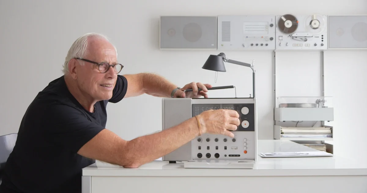
The funny thing? When you design this way—when you truly prioritize function—the result often is beautiful. Just look at Braun products, German typography, or Bauhaus architecture. Clean, functional, timeless.
Maybe that’s the real lesson: aesthetics and function aren’t opposites. But when you start with function and let form follow, you get better results than when you start with aesthetics and fit function in around it.
For Fellow Designers Learning to Code
If you’re coming from a design background into development, especially in Germany, prepare for some ego bruising. Your beautiful mockups will get questioned. Engineers will push back on animations. Users will request “boring” features over delightful experiences.
Listen to them.
They’re not lacking vision. They’re solving real problems. And sometimes the best solution looks less like an award-winning portfolio piece and more like a well-organized spreadsheet.
That doesn’t make you less of a designer. It makes you a better one.
What’s your take? Do we over-design modern software, or do functional interfaces risk being too intimidating for new users? I’d love to hear your thoughts—especially if you disagree.
About: I’m a CS student in Germany with a graphic design background, exploring the intersection of aesthetics and functionality. Follow along at redouan.net as I figure this out.